Biological processing system and age-related decline of vision.
Abstract
This paper attempts to analyze and review the current implementation and design effectiveness of Walmart.com’s website’s pharmacy page form from an elderly user’s point of view. The purpose of this assessment is to understand the use of various design concepts related to contrast sensitivity, color sensitivity and visual hierarchy against the backdrop for users with diminishing visual perception. To begin with, the paper provides a high-level overview describing the model of human information processing stages and its applicability in this research followed by the signal detection theory that will help identify the essential components considered when assessing the webpage. The paper also discusses the human vision and the effect of aging on the human eye.
This research paper then evaluates the pharmacy webpage of Walmart.com using the above-mentioned concepts, theories, and models. While performing the analysis, the paper also weighs the effects of changes in luminance, hue, and size on contrast sensitivity. The paper concludes the assessment of the webpage with recommendations based on the analysis and research.
1. Model of human information processing stages
A model of human information processing stages, as shown in figure 1, provides a useful framework for analyzing the different psychological processes used in interacting with systems and carry out task analysis. (Wickens, Hollands, Banbury, & Parasuraman, 2012, p. 4).
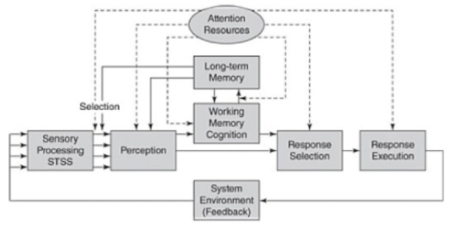
Figure 1: Model of human information processing stages. (Wickens, Hollands, Banbury, & Parasuraman, 2012, p. 4).
Stimulus from the environment are first processed by our senses–sight, sound, touch etc. The processed information is held in the short term sensory store (STSS) for not more than a split second. In the second stage, the sensory information is filtered by attention resources and the meaning of this filtered information is determined using past experiences stored in long-term memory. Perception is followed by either response (bottom path), or cognition and information storage (upper path), or both. The response may lead to changes in environment creating a new and different pattern of information to be processed. This is depicted using the feedback loop.
As the framework/scope for this review, we’ll consider just the first two stages of the model i.e. sensory processing and perception.
2. Signal detection theory
As Professor David Heeger (1998) explains, signal detection theory provides a precise language and graphic notation for analyzing decision making in the presence of uncertainty. It offers a way to analyze different kinds of decision problems. (Heeger, 1998).
Signal detection theory is applicable to a situation in which there are two states of world, Signal, and Noise. An observer can respond to these states as either ‘Yes’ (Signal is present) or ‘No’ (Signal is not present). The combination of these states and response produces a 2 X 2 matrix generating four possible outcomes: hit (signal present and observer responds "yes''), miss (signal present and observer responds "no''), false alarm (signal absent and observer responds "yes"), and correct rejection (signal absent and observer responds "no"). Hits and correct rejections are good. False alarms and misses are bad. (Wickens, Hollands, Banbury, & Parasuraman, 2012, p. 4). This leads us to the two main components to the decision-making process i.e. information acquisition and criterion, where information acquisition is gathering sensory data that would help detect a signal and response criterion, is the variation in an observers’ response after detecting the signal/noise.
3. Human Vision and Effect of Aging
Let’s consider the instrument of sight. The human eye contains a variable focus lens, a round aperture through which light enters the eye (the pupil), and a sensor array (the retina). The lens focuses a small, inverted picture of the world onto the retina. The iris performs the function of a variable aperture, helping the eye to adjust to different lighting conditions. Other important features include the fovea, where vision is sharpest; the two principal optical elements; and the large eye muscles that control the eye movements. (Ware C, 2013, p. 41).
It is also important to understand how human vision is affected with aging. The human ocular lens is a tissue capable of changing its shape to dynamically adjust the optical power of the eye, a function known as accommodation, which gradually declines with age. (Bailey, Twa, Gump, Venkiteshwar, Bullimore, & Sooryakumar, 2010). Also, there’s massive increase in the stiffness of the human lens nucleus with age. (Heys, Cram, & Truscott, 2004).
4. Walmart.com/pharmacy - Review
In this ever-changing world of technology, access to products and services is just fingertips away. The current e-commerce scenario is a typical example of this. The current e-commerce websites consist of rich graphics, interactive widgets and loads of information and Walmart.com/pharmacy is no different. This paper is an expert review of the current implementation, shown in figure 2, of Walmart.com/pharmacy against the backdrop of users with age-related decline of vision.

Figure 2: Left - Walmart.com/pharmacy website (screenshot as on Sep 28, 2017). Right - skeleton region map (right)
4.1. Contrast - Luminance, Brightness & Lightness
Contrast is a salient visual feature that draws immediate visual attention. Rod sensors in the human eye are in the vicinity of 100 times more sensitive to luminance than the color-sensitive cones. In other words, luminance affects contrast the most. Changes in luminance create a pattern of contrast that conveys the majority of visual information to the viewer. In figure 2, The luminance between the main background (white) and the individual background of regions 4, 5, 7, 8, 9, 10, 11 is very low. This subtle difference in the background luminance affects the perceived brightness of the regions, thus affecting the overall contrast.
In an experiment conducted by Sekuler, Hutman, & Owsley, a set of younger observers and older observers were exposed to vertical gratings with varied contrast. It was found that at lower special frequencies (targets with coarse structure), the older observers needed three times as much contrast to the see the gratings as did the younger observers. (Sekuler, Hutman, & Owsley, 1980). Thus, low contrast results in non-discrimination of regions from the main background as well as each other, especially in case of elderly users.
Furthermore, an experiment conducted by Toscani, Valsecchi, & Gegenfurtner in 2013 clearly showed that where an observer looks can strongly modulate their reports of simple surface attributes like lightness. Observers tend to take into account the brighter parts of objects when asked to match the color or lightness of these objects. Also, the observers tend to fixate on the brighter parts of the objects as they make their match. (Toscani, Valsecchi, & Gegenfurtner, 2013). This proves that it will be difficult of users to fixate on the regions with low brightness as opposed to those with high brightness and thereby directing attention to less important regions rather than the primary functions which user expects to accomplish.
On a positive note, the website uses large sections and big texts. Large objects require less sensitivity to contrast.
4.2. Low Contrast Text
According to Katie Sherwin, reading low contrast text strains our eyes, making us all feel older, and a little less capable. The insufficient contrast between the text color and the background degrades the user experience as legibility suffers, discoverability and findability are reduced, user confidence diminishes and cognitive strain increases. Mobile use becomes even more difficult. (Sherwin, 2015).
The contrast ratio of the text and background in region 1 from figure 2, is 5.01:1 and so is the ratio of the text and background in region 2. In the case when the website is viewed on devices with a smaller screen with, the contrast ratio drops further down to 4.68:1, as shown in figure 3, for the main menu. As pointed out by Sekuler, Hutman, & Owsley, older users need three times as much contrast to see fine discriminations as required by younger users. According to the Web Content Accessibility Guidelines (WCAG) 2.0, the enhanced contrast standards (level AAA) requires a contrast ratio of at least 7:1 for the visual presentation of text and images.

Figure 3: Walmart.com/pharmacy for mobile (screenshot as on Sep 28, 2017)
4.3. Contrast and Hue sensitivity
Elderly users also suffer from a decline in hue sensitivity, especially for the shorter wavelengths i.e. Blue and shades of blue. (Sample, Esterson, Weinreb, & Boynton, 1988). Since a major part of the website consists of blue, it’ll be difficult for elderly users to discern hue, resulting in difficult to discriminate components/sections of website form one another.
Furthermore, as age progresses, the human lens starts yellowing. Thus, less blue light reaches the retina. (Rukmini, Milea, Aung, & Gooley, 2017). The blue text might be seen as yellow by elderly users.
Human contrast sensitivity is not only limited to changes or differences in luminance but also to differences in color. Perceived yellow text on the grey background may not provide enough contrast, making the text illegible.
4.4. Visual hierarchy
According to the model of visual hierarchy, viewing pattern is guided by two distinct cognitive processes: searching and scanning. The search process can be influenced by attributes such as the size, color, location, text style and visual information (images) of components and the scan process can be influenced by attributes such as proximity and order of components. (Djamasbi, Siegel, & Tullis, 2011). Djamasbi, Siegel, and Tullis also concluded that images of faces, placed above the fold, attracted more attention than size, color, location, text style.
Excessive use of real-life images and bold, big, saturated text leads to more fixations as every element on the webpage is directing attention towards itself. This can have two consequences; first increase in visual load/fatigue; second increase in time required to find relevant information, leading to increased user frustration.
5. Recommendations
Walmart must consider increasing the overall contrast of the website. This can be achieved by increasing the brightness of the regions and text used. For regions with grey backgrounds, contrast can be achieved by using clear lines and edges. Color blue should be used wisely for backgrounds. Avoid using blue colored fonts. Create clear visual hierarchy using, size, color, location and images leading users to entry points of primary tasks. Avoid using too many images. Images are strong attention attracting signal. Consider using images to highlight important sections of the website.
6. Conclusion
The paper began by laying down the framework for review using the Model of human information processing stages. After establishing the framework, the paper intends to describe the concepts of signal detection theory, Visual vision, and effects of aging. Using these concepts, the paper analysis Walmart.com/pharmacy website from and elderly users point of view. While reviewing the website, the paper discusses various aspects of visual perception; contrast, luminance, brightness, lightness, and hue. The lists recommendations to improve the website’s efficiency and accessibility.
References
Bailey, S. T., Twa, M. D., Gump, J. C., Venkiteshwar, M., Bullimore, M. A., & Sooryakumar, R. (2010). Light scattering study of the normal human eye lens: Elastic properties and age dependence. IEEE Transactions on Bio-Medical Engineering, 57(12), 2910–2917. http://doi.org/10.1109/TBME.2010.2052393
Djamasbi, S., Siegel, Tullis, T. “Visual Hierarchy and Viewing Behavior: An Eye Tracking Study,” in Human-Computer Interaction, Design and Development Approaches, Lecture Notes in Computer Science, 2011, (6761:2011), pp. 331-340.
Heeger, D. (1998). Signal detection theory.
Heys, K. R., Cram, S. L., & Truscott, R. J. (2004). Massive increase in the stiffness of the human lens nucleus with age: the basis for presbyopia?.
Posner, M. I., Snyder, C. R., & Davidson, B. J. (1980). Attention and the detection of signals. Journal of Experimental Psychology: General, 109(2), 160-174. doi:10.1037/0096-3445.109.2.160
Rukmini, A. V., Milea, D., Aung, T., & Gooley, J. J. (2017). Pupillary responses to short-wavelength light are preserved in aging. Scientific Reports (Nature Publisher Group), 7, 43832. doi: http://dx.doi.org.ezp.bentley.edu/10.1038/srep43832
Sample, P. A., Esterson, F. D., Weinreb, R. N., & Boynton, R. M. (1988). The aging lens: in vivo assessment of light absorption in 84 human eyes. Investigative ophthalmology & visual science, 29(8), 1306-1311.
Sekuler, R., Hutman, L., & Owsley, C. (1980). Human Aging and Spatial Vision. Science, 209(4462), 1255-1256. Retrieved from http://www.jstor.org/stable/1684528
Sherwin K (2015, June). Low-Contrast Text Is Not the Answer. Nielsen Norman Group. Retrieved from https://www.nngroup.com/articles/low-contrast/
Tang, Y., & Zhou, Y. (2009). Age-related decline of contrast sensitivity for second-order stimuli: earlier onset, but slower progression, than for first-order stimuli. Journal of Vision, 9(7), 18-18.
Toscani, M., Valsecchi, M., & Gegenfurtner, K. (2013). Optimal sampling of visual information for lightness judgments. Proceedings of the National Academy of Sciences of the United States of America, 110(27), 11163-11168. Retrieved from http://www.jstor.org/stable/42706392
Wickens C, Hollands J, Banbury S, & Parasuraman R. (2012). Engineering Psychology and Human Performance (4th ed.). Psychology Press
Ware C. (2013). Information Visualization, Perception of Design (3rd ed.). San Diego, CA: Academic Press